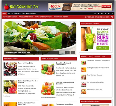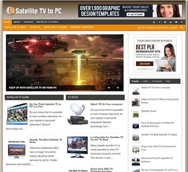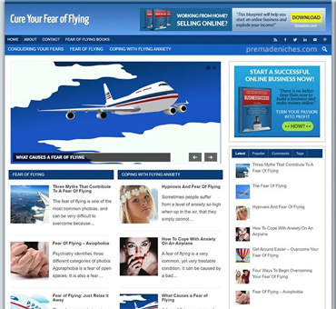


Start With the Site’s Purpose
Customizing a premade niche website is not simply a matter of replacing a logo and changing a few colors. The strongest results come from reshaping the site around a specific audience, a clear promise, and useful content that reflects your knowledge. Treat the existing website as a framework, not a finished business. Keep what supports your goals, remove what does not, and add evidence that helps visitors trust your recommendations.
Begin by identifying the website’s exact purpose. A broad topic such as fitness, gardening, travel, or personal finance is usually too wide for a focused content plan. Narrow the audience by considering its problems, experience level, location, budget, and preferred solutions. “Gardening for renters with balconies” gives you a stronger direction than “gardening.” A precise audience makes decisions about tone, categories, examples, products, and calls to action much easier.
Write a one-sentence positioning statement before editing pages. It should explain who the site serves, what problem it addresses, and what makes its guidance useful. For example: “This site helps apartment gardeners grow herbs in small spaces using low-cost, practical methods.” Place this statement in your planning notes, then check every major page against it. If a page does not serve the stated audience, revise it, move it, or delete it.
Audit the Premade Content
Make a complete inventory before changing anything. Record every page, post, category, menu item, image, form, widget, and prominent button. Note whether each element is useful, outdated, vague, duplicated, or unrelated to your intended audience. A simple spreadsheet can include the URL, page purpose, target reader, primary action, current status, and planned change.
Do not assume that polished writing is accurate or suitable. Premade content may use generic claims, awkward wording, unsupported recommendations, or examples that do not match your market. Read each sentence as a visitor would. Ask whether it answers a real question, gives enough context, and makes a clear distinction between fact, opinion, and personal preference.
Related resource: If it fits your needs, you can explore Happiness Through Hypnosis Pre-made Affiliate Niche Website/Blog for more information.
Check for statements that require special care. Health, legal, financial, and safety topics need conservative language and reliable review. Replace guarantees with qualified explanations, avoid diagnosing readers, and direct people toward appropriate professionals when a decision carries serious risk. If you cannot confirm a claim, remove it or rewrite it without pretending certainty.
Review the site’s structure as well. A useful navigation menu should lead visitors toward understandable groups, not display every possible topic. Combine overlapping categories, use familiar labels, and keep the most important pages easy to find. A visitor should know within seconds what the site covers and where to begin.
Define Your Audience and Voice
Your audience profile should guide every content choice. Describe a typical reader without inventing a fictional biography that restricts your thinking. Focus on practical traits: what the reader already knows, what they want to accomplish, which obstacles slow them down, and what kind of explanation they can use.
A beginner may need definitions, warnings, and a sequence of small actions. An experienced reader may prefer comparisons, technical limitations, and faster decision criteria. You can serve both groups by placing a concise answer first, then adding optional depth under descriptive headings. Do not use complicated terminology merely to sound authoritative.

Choose a voice that fits the subject and audience. A home repair site may be direct and cautious; a recipe site may be warm and sensory; a business software site may be structured and precise. Persuasive writing does not mean exaggerated writing. Explain why a recommendation fits, mention where it falls short, and help readers decide rather than pressuring them.
Create a short style guide. Include preferred terms, spelling conventions, sentence length, heading patterns, capitalization, and rules for discussing uncertainty. Decide whether the site uses first person, how it addresses readers, and how it handles measurements, dates, prices, and product names. Consistency makes a small site appear deliberate and dependable.
Turn Generic Pages Into Useful Guides
Start with the pages that receive the most attention: the homepage, main category pages, cornerstone guides, and contact or about pages. Rewrite the opening section so visitors immediately understand the site’s focus and the practical benefit of staying. Avoid empty introductions. State the problem, explain the approach, and show what the reader can do next.
A useful guide normally includes a clear question, a direct answer, supporting explanation, practical steps, limitations, and a next action. For example, an article about choosing balcony planters can compare weight, drainage, sunlight, watering needs, and available space. It should also explain when a particular choice is unsuitable. Such details are more persuasive than a list of attractive features.
Use examples that match your audience’s real circumstances. If the site serves renters, discuss removable solutions and restrictions that may apply. If it serves beginners, define terms before using them. If it serves a regional audience, avoid presenting one climate, currency, delivery system, or legal rule as universal.
Rewrite With Original, Helpful Content
Do not edit every premade paragraph mechanically. First decide what the page must accomplish, then rebuild weak sections around that purpose. Preserve a useful fact or structure when appropriate, but replace generic wording with explanations, examples, comparisons, and instructions that reflect your niche.
Each article should have one main question or task. Supporting sections may address related concerns, but they should not pull the reader into unrelated subjects. A focused article is easier to navigate and easier to maintain. It also gives you a clear standard for deciding whether a new paragraph belongs.
Use specific headings that tell readers what they will learn. “Choosing the Right Soil for Containers” is more helpful than “Important Considerations.” Under each heading, answer the implied question. If a section discusses drainage, explain how poor drainage affects plants, what signs to watch for, and which adjustments can help.

Include observable checkpoints in tutorials. After a reader changes a setting, they should know what successful completion looks like. If the result is not visible, describe a way to inspect it. Add an adjustment when a step fails. This converts general advice into a process a visitor can follow without guessing.
Improve the Homepage
The homepage should function as a clear map, not a wall of promotional language. Place the site’s main promise near the top, followed by a brief explanation of who the content serves. Then guide visitors to the most useful categories, beginner resources, recent guides, or decision tools.
Choose a primary action. It might be reading a starter guide, comparing options, joining a newsletter, or contacting you. Additional links can remain available, but too many competing buttons weaken direction. Make the preferred action visually clear and describe what happens after the click.
Use proof carefully. If you have genuine qualifications, transparent testing methods, editorial policies, or relevant experience, explain them plainly. Do not add invented testimonials, awards, statistics, or claims of independent testing. Trust grows when visitors can understand how information is selected and when limitations are acknowledged.
Revise page titles, introductions, and summaries so they match the actual content. A dramatic promise that the page cannot fulfill creates disappointment. Accurate expectations may seem less aggressive, but they produce a more credible experience and make visitors more likely to continue reading.
Organize Categories and Internal Links
A niche site becomes easier to use when related content forms a logical path. Create categories based on reader goals rather than internal publishing history. A cooking site might organize content by techniques, dietary needs, equipment, and meal planning, provided those groups do not overlap confusingly.
Related resource: If it fits your needs, you can explore Affiliate Marketing Pre-made Affiliate Niche Website/Blog for more information.
Limit category depth. If visitors must open several menus before reaching an article, simplify the structure. Use breadcrumbs or related links when they genuinely help people move between connected topics. Avoid adding links merely to fill space.
Plan internal links while revising content. Link from introductory pages to detailed guides, from detailed guides back to foundational explanations, and between articles that help with the next decision. Use descriptive link text so readers know what they will find. Check every link after publishing; broken or misleading links reduce confidence.

Keep important pages current. Add a review date only when you actually review the page, and explain meaningful changes rather than changing dates without substance. Revisit time-sensitive information, product availability, software instructions, regulations, and recommendations on a schedule suited to the topic.
Customize Visuals and Brand Elements
Visual changes should reinforce the site’s subject and improve comprehension. Select a readable typeface, sufficient contrast, consistent spacing, and an image style that matches the audience. Do not sacrifice legibility for decoration. Visitors should be able to read paragraphs comfortably on phones as well as larger screens.
Replace stock images that imply experiences you cannot support. Use original photographs, properly licensed images, diagrams, screenshots, or simple illustrations when they explain something. Add meaningful alternative text for informative images. Decorative images can use empty alternative text so screen readers do not announce unnecessary details.
Create a small design system. Define primary and secondary colors, button styles, heading sizes, image proportions, and spacing rules. Applying the same choices across pages makes the website feel coherent. Test color combinations and interactive elements for visibility, especially when text sits over images or colored backgrounds.
Do not hide essential information inside visual elements. A visitor should not need to interpret an icon, hover over a button, or view a large image to understand the main instruction. Design should support the content, not replace it.
Build Trust Through Transparency
Customization should make the website more honest, not merely more attractive. Add an about page that explains the site’s focus and editorial approach without exaggerating credentials. If recommendations involve affiliate relationships, sponsorships, or other commercial interests, disclose them clearly where relevant.
Separate information from promotion. A comparison should explain criteria, advantages, disadvantages, and suitable use cases before presenting a commercial action. If a product or service is not appropriate for some readers, say so. A limitation can strengthen a recommendation because it shows that the decision is not one-sided.
Create a contact route that works. State what kinds of messages you accept, avoid promising response times you cannot maintain, and protect personal information. If the site collects email addresses, describe the purpose in understandable language and provide the required controls for unsubscribing or managing preferences.
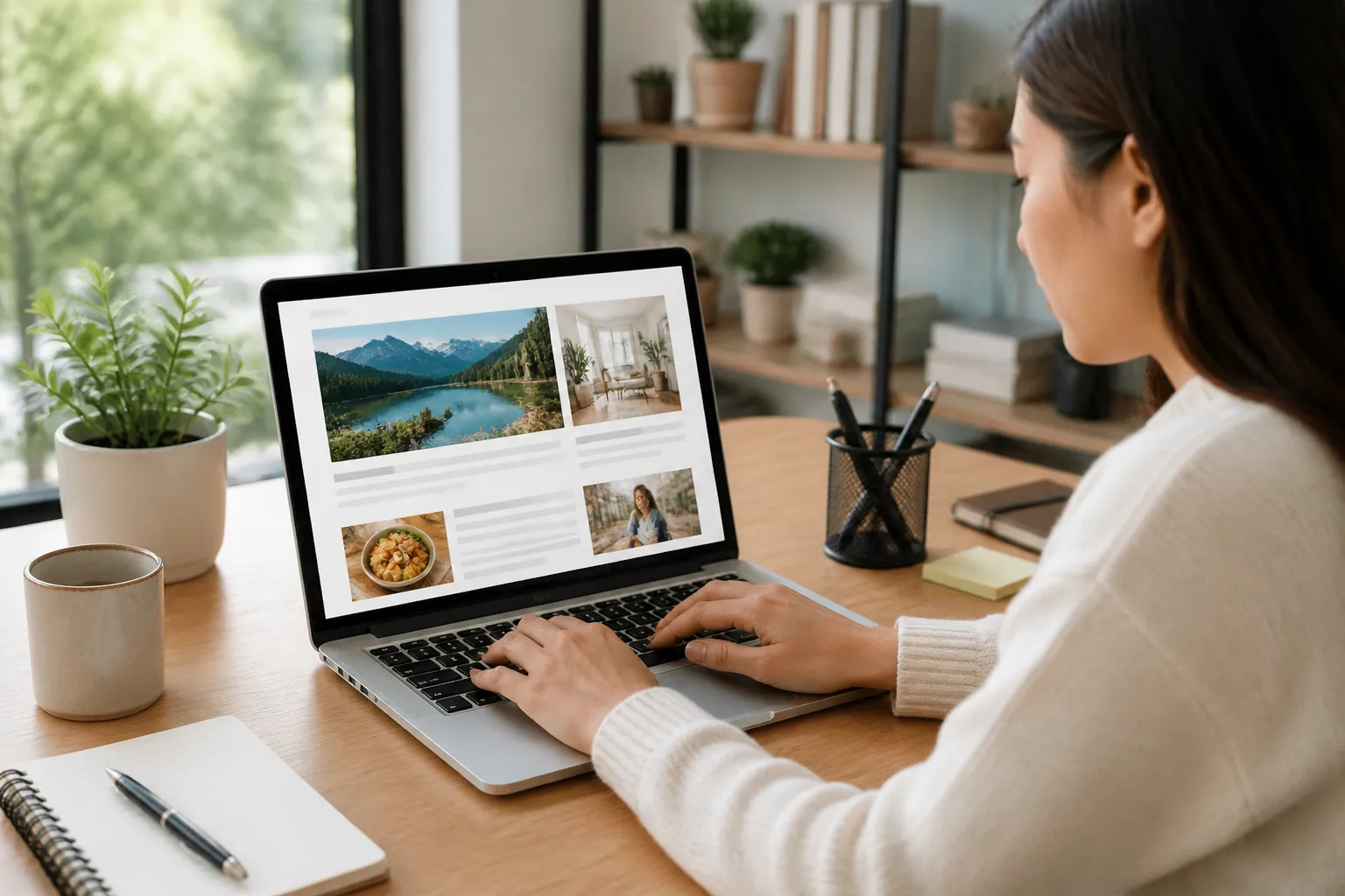
Check accessibility before launch. Test keyboard navigation, heading order, form labels, link clarity, image descriptions, contrast, and text resizing. Accessibility is not a decorative feature; it determines whether people can use the information. Fixing these issues also tends to improve clarity for everyone.
Optimize Performance Without Losing Meaning
Remove unnecessary plugins, oversized images, animations, and duplicated scripts. Compress images while retaining enough quality for the subject. Use responsive formats and test pages on a slower connection if possible. A fast page helps readers reach the information before frustration causes them to leave.
Review mobile layouts manually. Check whether menus open correctly, headings wrap sensibly, buttons are easy to tap, and tables remain readable. A page that looks acceptable on a desktop monitor may become difficult to use on a narrow screen.
Keep performance changes tied to the visitor’s task. Do not remove a useful diagram simply because it adds weight; first ask whether it can be optimized or replaced with a lighter format. Likewise, do not add a video when a short explanation would answer the question faster.
Measure and Improve the Content
Set practical measures before publishing. Track whether visitors reach important guides, use navigation, complete forms, return to related pages, or leave immediately. These signals do not explain everything, so interpret them alongside page purpose and reader feedback.
Ask a small group of suitable readers to perform tasks. Give them a page and ask what they think it offers, where they would click next, and what remains unclear. Observe rather than correcting them during the task. Confusion reveals problems that private editing can miss.
Use feedback to make targeted changes. If readers overlook a key instruction, move it higher or rewrite the heading. If they ask the same question repeatedly, add an example or clarification. If a page attracts attention but fails to guide visitors onward, strengthen its internal links and next action.
Avoid changing many variables at once when you are trying to learn what works. Revise one major element, record the reason, and review the result after enough time has passed to provide meaningful observations. Measurement is useful only when the question is clear.
FAQ
Should every premade article be rewritten?
No. Keep a page when it is accurate, relevant, distinctive, and useful for your chosen audience. Edit sections that are weak, and remove pages that cannot support the site’s purpose. Quality matters more than preserving the original volume.
How much should I change the design?
Change enough to create a coherent identity and improve usability. Prioritize navigation, typography, contrast, spacing, mobile behavior, and calls to action before decorative details. A modest design with clear structure is usually stronger than an elaborate design that distracts from the content.
Can I use artificial intelligence to help edit pages?
It can assist with outlines, alternative wording, or lists of questions to investigate, but it should not replace judgment. Check every factual statement, remove unsupported claims, and add your own useful examples. Readers need accountable information, not fluent text that has never been reviewed.
How often should content be updated?
Use the topic’s rate of change as your guide. Stable educational material may need occasional review, while software instructions, regulations, product information, and recommendations can change sooner. Update when facts, links, audience needs, or site goals change, and document substantive revisions.
What should I do if the niche is too broad?
Choose a narrower reader problem rather than adding more categories. Define the audience, situation, and desired result. A focused site can expand later after it has established a useful base of related content.
How do I know whether customization is working?
Look for clearer navigation, stronger reader engagement with relevant pages, fewer repeated questions, and improved completion of intended actions. Combine analytics with direct feedback. No single measure proves success, especially when different pages serve different purposes.
Should I remove all promotional content?
Not necessarily. Promotional content can fit when it is clearly identified, relevant, and supported by useful information. Keep the reader’s decision first. Explain alternatives, limitations, and possible conflicts rather than presenting every recommendation as universally suitable.
What is the first practical task?
Create the content inventory and write the positioning statement. These two tasks establish what the site currently contains and what it should become. Without them, design edits can consume time while leaving the main problem unresolved.
Conclusion
A premade niche website becomes valuable when customization connects its structure, content, visuals, and trust signals to a specific audience. Start with a clear purpose, audit what already exists, and rebuild the pages that matter most. Use practical examples, visible checkpoints, honest limitations, accessible design, and reliable navigation.
Related resource: If it fits your needs, you can explore Content Curation Mastery Pre-made Niche Website/Blog for more information.
Work in stages rather than trying to perfect the entire site at once. Finish one important visitor path, test it with real users, correct confusion, and then apply the lessons elsewhere. The result should not merely look different from the original template. It should help the right readers understand their problem, choose a sensible next step, and return because the information consistently earns their confidence.
WP AI Autoblogging Beginners Guide
Best WordPress AI Autoblogging Plugin
WP Learning 101
Free YouTube Backlink Generator Software

Latest Product